
User Experience Researcher & Service Designer
Avalon Movie Theater
December 2021 - March 2022
The Goal
Create a seat reservation process for a fictional movie theater to help users select the best available seats for their needs.

Pain Points
I conducted user interviews to identify the current issues with the process.
“I wish I could buy half of the next seat so no one would sit next to me.”
“It is hard to identify which theater we are buying tickets for in the process.”
“I want to easily see what seats are available at different times.”
These were the most important pain points identified with the research:
Inability to change seats if the theater gets full.
Inability to pay more to guarantee no one sits next to you.
Difficulty recalling the location, date and time of the tickets purchased.
Difficulty in assessing what are the best seats available with different showtimes.

Solutions
To start generating ideas to address the pain points identified, I engaged in the "How Might We" and Crazy Eights activities along with a competitive audit. I found the following opportunities for improvement:
Have the location, time, date, and movie visible at all times.
Provide the user a way to easily identify which time and date has the best seats available fit a large party.
Have an option for the user to purchase the seats next to them to reduce noise and guarantee distance from other viewers in the theater.
Provide the ability for users to change the seats purchased if the seats next to them fill up and they are wanting more space.

Accessibility
Annotations - I added annotations to the digital wireframes so assistive technology, such as a screen reader, can guide users through the seat reservation process.
Headings - I labeled headings in response to the scale of the text to allow screen readers to explain the hierarchy of information. Shown is the movies list screen.
Labels - I added labels so developers can code for screen readers to explain the function of buttons and images. Shown is an image of the film on the movie list page. Clicking the image will connect the user to the seat reservation page or clicking the left arrow on a keyboard will allow the user to read more about the film first.
Test the User Flow
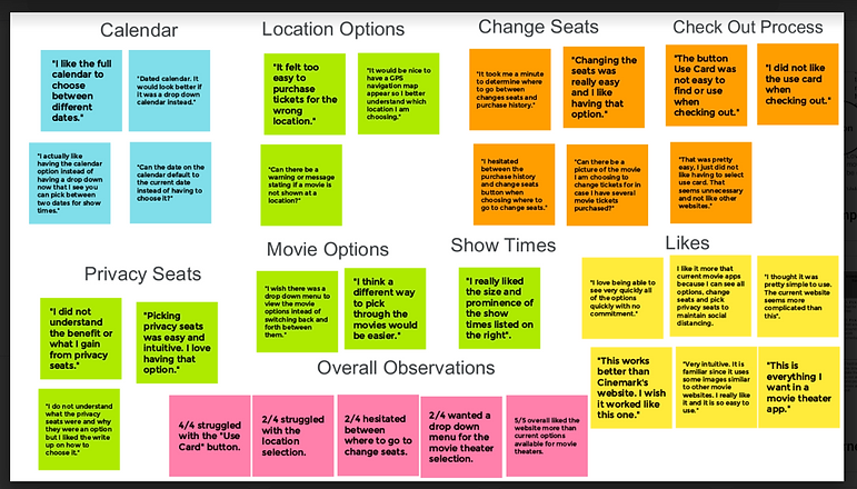
I conducted two moderated usability studies to test the solutions created to address the user pain points. During the usability study, the users expressed how the new flow solved the pain points encountered when reserving a movie theater seat. There were few changes that needed to be made to the overall design.
"I like it more than current movie apps because I can see all options, change seats and pick privacy seats to maintain social distancing."
"Very intuitive. It is familiar since it uses some images similar to other movie websites. I really like it and it is so easy to use."
"I thought it was pretty simple to use. The current websites are more complicated than this".

Issues Found
One of the features that needed to be altered was how the movie and location options were chosen. The users had concerns about purchasing tickets for the wrong location and wanted it addressed. This was a critical part of the user flow.
"I wish there was a drop down menu to view the movie options instead of switching back and forth between them."
"I think a different way to pick through the movies would be easier."
I created a drop down menu for the location so the user will have to intentionally choose where the movie will be watched instead of accidentally picking the wrong location.
I created a drop down menu for the movie list as well for consistency and to solve the concern the user had.

Issues Found Cont.
One of the key features to resolve the problem of not having enough privacy was not made clear enough.
"I do not understand what the privacy seats were and why they were an option but I liked the write up on how to choose it."
I change the term "privacy seats" to "buffer seats" for a better understanding of the function of this feature.
The word "Buffer" is highlighted in an orange-red across the website to draw attention to the option on the homepage and seat reservation pages.
The letter "B" in orange-red represent this feature when selecting the option. Using consistent colors and symbols across the website will help the user remember this feature and its purpose.

Final Product
The final design will allow users to assess the dates, times, locations, and movies to select the perfect seats so they can spend time with friends or engage in their hobby to enjoy their free time. This option is currently unavailable on the market.
https://xd.adobe.com/view/67f56db1-78bb-460f-a175-3416c09866da-32a6/?fullscreen
What I learned:
The biggest challenge was creating a dynamic user flow to solve the user pain points rather than choosing a linear path which is much easier to build and a much more common solution.
This design is complicated to build. It would require input from developers on what aspects could be developed upfront and what could be developed over time to give the users all possible options of movies, times, dates, and locations available for a theater.
I chose to give the user only a couple of options in the flow in order to conduct a usability study in a timely manner and test the solutions.
To meet the user needs, I had to set aside my doubts on what was possible to put on one page and trust the user feedback.